A Practical First Edit: Mobile Menus and Pages for an Architecture or Interior Site
Start by defining your services and the path to an inquiry. This guide walks first-time site operators through planning pages, editing a mobile menu, linking buttons, and checking the result.
An architecture or interior design site should do more than display project photos. Visitors need to understand what you offer, review relevant work, and find a clear way to ask about a project. Instead of creating a large menu at the outset, build a structure that helps visitors find their next step on a mobile screen.
1. Write down the purpose and content before building pages
Start with one sentence describing whom you serve and what you do. For example: “We introduce residential renovation consultations and completed work.” Use that sentence as a reference when writing the home-page introduction and naming menu items.
Next, list the pages you need and the main information each one will contain. A simple first version might include Home, Projects, Services, Studio, and Contact. If you provide several kinds of services, separate them when visitors need the distinction to understand what you offer. Avoid creating multiple pages that contain nearly identical information.
- Check that you have real information to provide for each service.
- For project pages, prepare the space type, scope of work, and photos for each case.
- On the contact page, explain what visitors should do next.
- Keep content that is not ready out of the menu until it is prepared for publication.
Hypothetical example: A small studio that offers both residential renovation and commercial interiors could distinguish the scope of those services on its Services page, then group examples as residential or commercial on its Projects page. This example illustrates a possible structure; it does not describe the record of any particular business.
2. Keep the mobile menu short and clear
Include only the highest-priority destinations in the mobile menu. Names such as “Projects,” “Services,” “Studio,” and “Contact” make their purpose easy to guess. Replace internal jargon with wording that a first-time visitor can understand. If the menu grows too long, it can become harder to find the important pages.
Keep the page hierarchy as simple as the content allows. If you divide projects into residential and commercial work, check whether that distinction actually helps visitors browse. If you have only a few projects, or the categories are not clear, it may be easier to show the type of space within one Projects page for now.
- Tap each menu item and check that it opens the intended page.
- Make sure the menu label matches the destination page.
- Remove long labels and duplicate items where possible.
- Make the route to the Contact page or an inquiry action easy to find.
The location and opening behavior of menu controls can vary with the editing interface. Set them in the actual editor, then check them in mobile preview. Do not judge the menu from the desktop layout alone.
3. Make the first edits in TalkTalkMySite
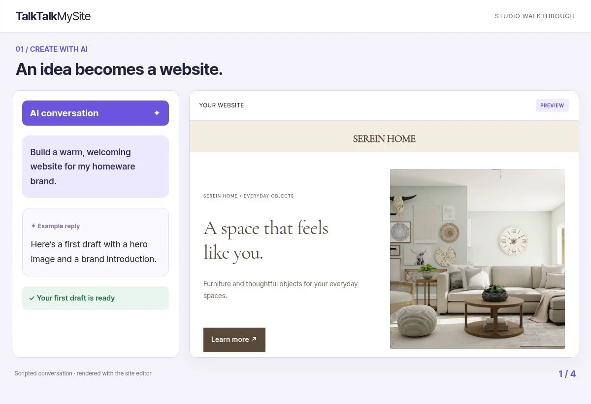
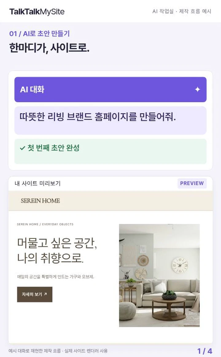
TalkTalkMySite supports both AI chat and visual editing. First, enter your planned page list and the information visitors should see into AI chat to request a draft. Treat the result as a draft to review, not a finished design. Edit it to reflect your actual services and page names. Do not assume that an AI result guarantees the structure you want or will work without errors.
Then open each page in visual editing and check its title, body text, and menu connection. When editing a menu, verify the destination for every item as well. Choose images that relate to the projects. You can search licensed stock images and video, but do not present stock imagery in a way that could be mistaken for photos of your own completed work. Check that each project image agrees with its caption and description.
- Create the pages first and give them clear names.
- Add the essential information visitors need on each page.
- Add mobile menu items and connect them to the corresponding pages.
- Make sure each home-page button leads to the page or contact route its label promises.
- Save the changes and review them again in mobile preview.
4. Clarify each page’s role and the inquiry path
The home page briefly explains what you offer and where visitors can go next. The Projects page helps people compare examples and explore details. The Services page describes the scope or items you provide. The Studio page explains who operates the business and how it works. The Contact page clearly states how to start a conversation and what information visitors may want to prepare.
For example, connect a “View projects” button on the home page to Projects and a “Request a consultation” button to Contact. If a button’s wording and destination do not match, visitors may be confused. Tap every button and see which screen actually opens. Creating a Contact page does not, by itself, guarantee that an inquiry will be received or answered automatically. Check the setup and operating process separately.
5. Check the mobile experience before publishing
Before publishing, open and close the menu in a phone-sized preview and tap every item and button to verify navigation. Check that titles are not cut off, buttons do not overlap other content, and long service names remain readable in the menu. Confirm that photos fit the purpose of their pages and that no unfinished page is still exposed in the menu.
TalkTalkMySite Basic supports shared SEO, while Standard supports per-page SEO and stores. Premium supports multilingual stores. Check which plan includes the functions you need, but do not treat SEO settings as a guarantee of search rankings or visitor numbers. HEAD meta tags work on published sites, and custom scripts run only on connected customer domains. When first organizing menus and pages, do not assume you need to insert code: check the page structure and real navigation links first.
- Check the menu, page titles, and button destinations from start to finish on mobile.
- Confirm that saved changes appear in the published site.
- If you need per-page SEO, first check which plan supports it.
- As your next task, finish the guidance on the Contact page, then follow the mobile route through the site once more.
The key is to define each page’s purpose before styling the menu, then verify the connections after building the pages. Rather than trying to complete everything at once, first make sure a visitor can go from the home page to project and service information, then find a working route to get in touch.