Fashion Brand Mobile Navigation and Page Structure: A First Editing Sequence
For a first-time fashion brand site operator, organize the menu and pages in the order customers use them on mobile. Keep the structure clear, then check links and the path to product information before publishing.
When editing a fashion brand site for the first time, the priority is not to create as many pages as possible. It is to help visitors find products and essential information quickly on a phone. Decide on menu labels and order first, build the pages next, and then test links and the shopping path on an actual mobile view. The same sequence can be used in TalkTalkMySite’s visual editor.
1. Start with what mobile visitors need to do
Write down no more than three common tasks visitors come to the site to complete. For example: browse new arrivals, check size information, or find shipping and exchange details. Use these tasks to guide both the menu and the page structure. Even if you usually work on a desktop, judge the layout by how it reads on a narrow screen.
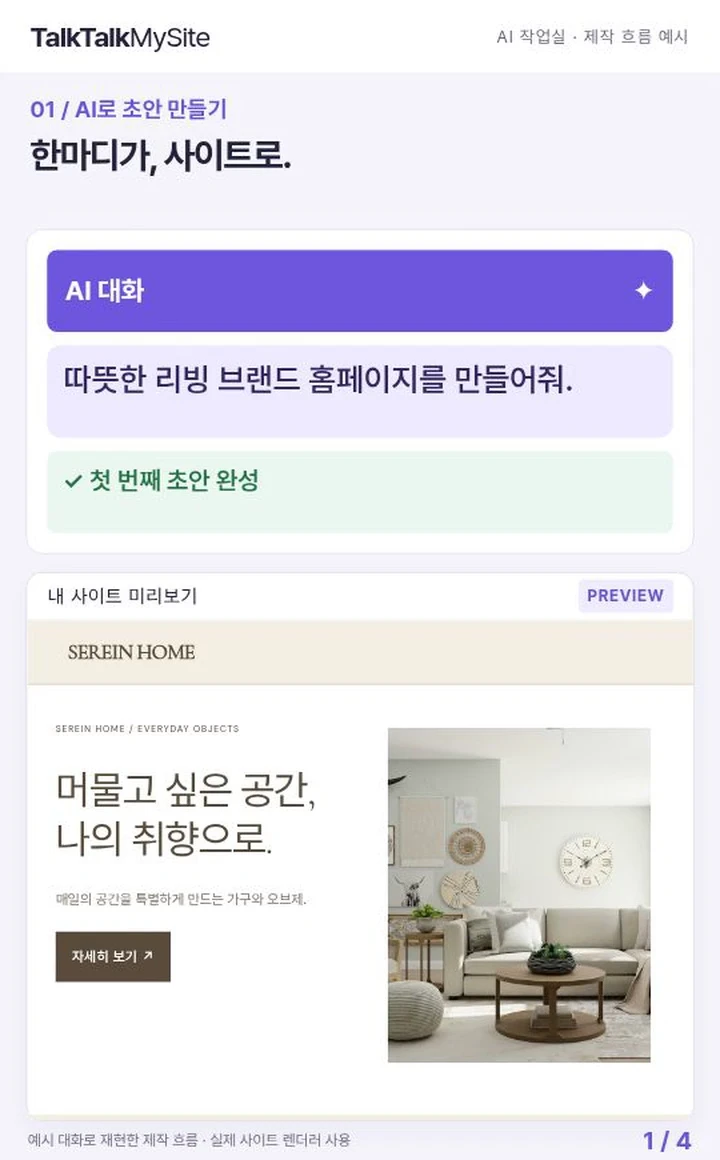
- Decide whether new arrivals or a particular product category should be easiest to find.
- List the information customers may need before buying, such as sizing, materials, and shipping or exchange details.
- Keep pages that are not ready off the menu; record them as work to complete before publishing.
**Hypothetical example:** A small clothing brand might prioritize browsing new arrivals, checking size guidance, and finding shipping and exchange information. It could build its menu around those three tasks. This is an example, not a claim that the same menu suits every brand.
2. Keep the mobile menu focused and clear
Put the most important items first, and use labels whose purpose is apparent at a glance. For example, a “Shop” section might contain “New Arrivals,” “Tops,” and “Bottoms,” while “Customer Information” might contain “Size Guide” and “Shipping & Exchanges.” Group related items rather than listing everything at the top level, but avoid making visitors tap through several layers to reach a page.
- Put the primary product-browsing route near the top of the menu.
- Replace vague labels such as “Info” or “Other” with specific names.
- Check for duplicate items and links that lead to empty pages.
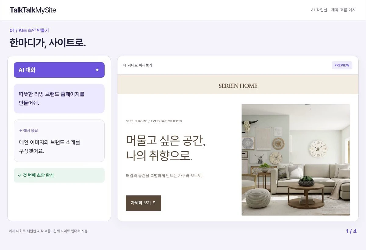
After adding or reordering items, open and close the menu in the editor’s mobile preview. If labels are cut off or the list is too long to scan, shorten names or revise the groups.
3. Define each page’s purpose before adding its content
Once the menu is set, describe the job of each page in one sentence. A product listing helps visitors browse; a product detail page supports a buying decision; a size guide helps them compare measurements. Avoid giving one page several unrelated jobs. Make its purpose clear near the top.
- Keep product names and images consistent and easy to distinguish in listings.
- Add only product information that is accurate and actually available, including size and material details.
- Separate verified operational information, such as shipping and exchange guidance, on an information page.
- If a page is not ready, check both its publishing status and whether it appears in the menu.
**Hypothetical example:** On a “Cotton Shirt” detail page, check that the available colors and sizes can be selected and that the material and measurements match the product information. Do not invent options or policies that the store does not provide.
4. Edit in small steps, then save and review
TalkTalkMySite supports AI chat and visual editing. Instead of asking AI to build the entire site at once, define a limited task, such as drafting menu labels or revising copy on one page. Compare the result with verified brand information, then refine it in the visual editor. Do not assume AI output is accurate; check product names, measurements, and policies yourself.
- Do not change menu labels, page content, and design all at once; separate the tasks.
- In mobile preview, review text size, line breaks, and button placement.
- After changing an item, save and recheck the related page and menu link.
5. Test the mobile journey before and after publishing
Before publishing, follow the actual route: open the menu, go to a product listing, open a product detail page, and then find the relevant information page. Check that each menu item and button leads where expected and that visitors can return without losing their place. A preview and a published site may differ, so review the customer-facing screen after publishing too.
- Open every menu link and confirm it reaches the intended page.
- Check that long product names and guidance text do not get cut off or overlap on mobile.
- Remove or fix pages still in progress, placeholder copy, and incorrect product details.
- Separately verify that the products and purchase-related setup are actually ready for customers.
Page-level search settings depend on the plan. Basic provides shared SEO, Standard supports per-page SEO and stores, and Premium supports multilingual stores. These features do not guarantee search rankings or visitor numbers. HEAD meta tags work on published sites, while custom scripts run only on connected customer domains.
Choose the next editing task
For your next work session, draft the menu, write down the purpose of three essential pages, and check their links in mobile preview. Then add verified product information and operating guidance, and repeat the same journey on the published site. Before adding more menu items, first confirm that visitors can find what they need in the structure you already have.