Mobile Menus and Page Structure for Pet Supplies: A First Editing Workflow
Plan a mobile menu around product categories and pre-purchase questions, connect the right pages, then test navigation and buttons on a real phone before publishing.
A pet-supplies site may offer food, treats, walking gear, toys, and hygiene products. Visitors may also want to browse by pet type or size. Instead of adding a long list of menu items, make it easy for people to reach the products and guidance they need in a few steps. The workflow below uses TalkTalkMySite’s visual editor as its reference point, but the planning principles apply to other site builders too.
1. Write down visitor goals before designing the menu
Before styling the menu, list two or three reasons someone might visit. They may be looking for a harness for walks, checking the ingredients in cat treats, or reading shipping and exchange information. If these different needs are all buried under one unclear label, visitors may struggle to find them.
- Group your main product lines into three to five categories. For example: walking gear, food and treats, toys, and hygiene products.
- List information visitors need before buying, such as sizing, feeding information, shipping and exchanges, or how to contact you.
- Use everyday words that describe what each menu item contains.
**Hypothetical example:** A shop focused on walking gear for small dogs might use “Walking Gear,” “Treats,” “Size Guide,” and “Shipping & Exchanges” as its main menu items. Adjust these labels to match your actual products and policies.
2. Plan the page list separately from menu visibility
Keep the menu short and focused on the main visitor goals. You can create as many pages as you need without putting every page at the top level of the menu. For instance, a “Walking Gear” page could organize harnesses and leashes, while a size guide could be linked from the relevant products.
Write one sentence describing the job of each page. “Food & Treats” might help visitors compare and choose products, while “Size Guide” explains how to measure and choose a size. Give each page a distinct purpose. Do not add a buy button to a page that does not offer products, and do not expose an unfinished guidance page in the menu.
- Put only frequently visited product categories and essential guidance in the top-level menu.
- Add subitems only when you have distinct content to organize under them.
- Before publishing, check whether draft or temporary pages are visible in the menu.
3. Create pages in the editor and connect them
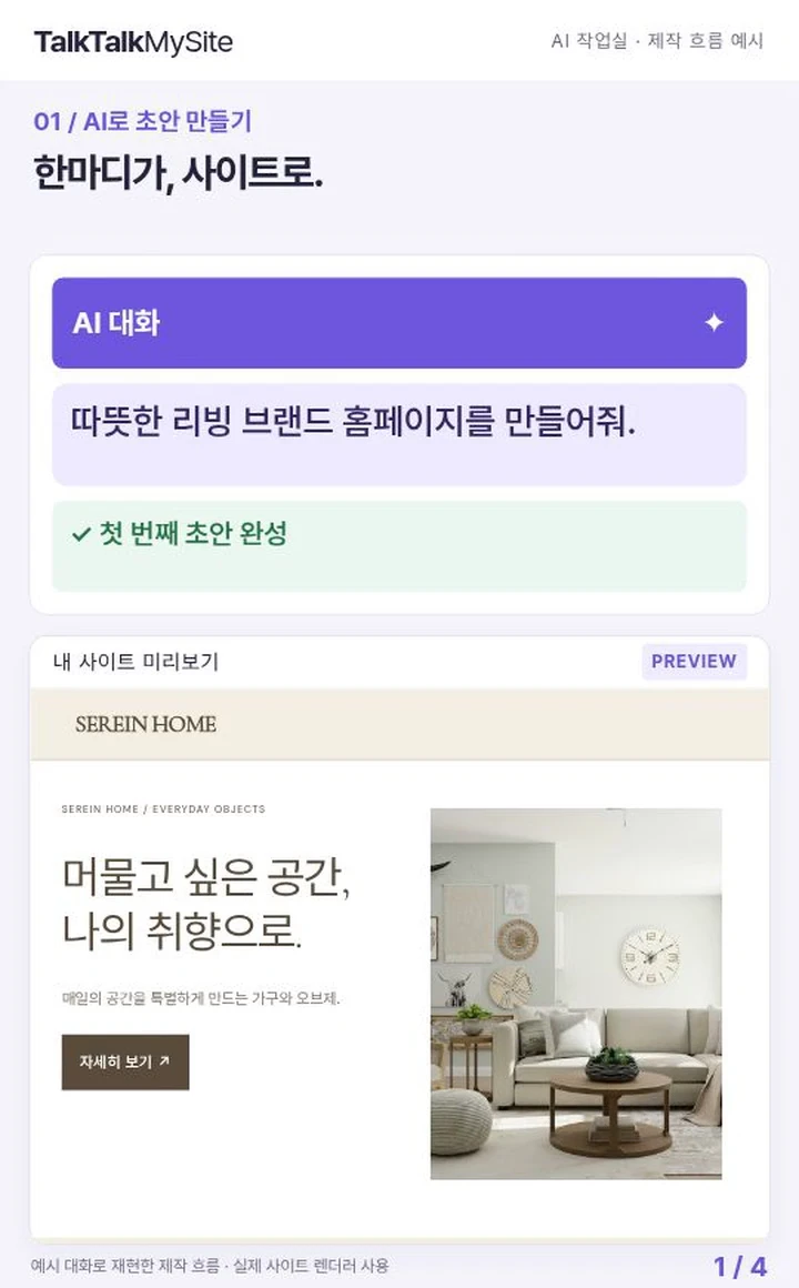
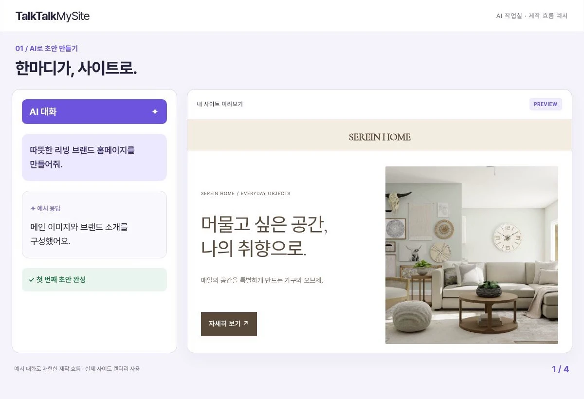
TalkTalkMySite supports drafting with AI chat and editing visually. Treat an AI-generated draft as a starting point: the operator must verify product names, materials, dimensions, instructions, and shipping terms. Do not keep unverified claims about effects or safety; include only information you can confirm and actually provide.
Create the pages you need, give them clear names, and then connect each mobile-menu item to the correct page. On a product-category page, check that the relevant products and selection information are present. On a guidance page, make the next step clear, such as reading instructions or finding a way to contact the business. Keep menu labels concise so they are less likely to wrap awkwardly or become hard to read on a phone.
- Check that the page title and menu label point to the same subject.
- Test each menu item to confirm it opens the intended page.
- Remove duplicate links to the same page and items whose purpose is unclear.
4. Check the mobile first screen and navigation flow
After organizing the menu and pages in the visual editor, inspect them at an actual phone screen size. Check that the menu opens and closes, long labels are not cut off, and the page title and main content make sense at a glance. Make button destinations specific: “View the Size Guide” is clearer than “Learn More.”
**Hypothetical example:** If someone chooses “Harnesses,” views a product, and then gets stuck choosing a size, link the product page to the size guide. Check that the visitor can also find a clear route back to the product after reading the guide. Use this flow only if the relevant product and pages are actually available.
- Open the menu and tap every item to confirm it leads to the intended page.
- Test links from guidance pages to related products or other next steps.
- On a phone, check whether the text, buttons, and page sequence feel easy to use.
5. Review before publishing and choose the next edit
Before publishing, review page titles, menu destinations, mobile display, and publication status. If you need search settings, take the feature scope into account: Basic supports shared site SEO; Standard supports per-page SEO and stores; Premium supports multilingual stores. None of these features guarantees search rankings, visitor numbers, or revenue.
HEAD meta tags work on published sites. Custom scripts run only when a customer domain is connected, so do not assume they will run in a test environment. For a first launch, publish the menu and essential pages, then note any confusion you observe during real navigation. Fixing one or two issues at a time makes the site easier to manage.
- Reopen the published pages and test the menu and key links again.
- Hide or improve any item that is empty or likely to mislead visitors.
- Choose one next editing task, such as improving the size guide or shortening a menu label.
Your next action is to choose your most important product category and describe the page’s purpose in one sentence. Use that sentence to name the menu item and create its destination page, then walk through the entire experience on your phone as if you were a visitor.